
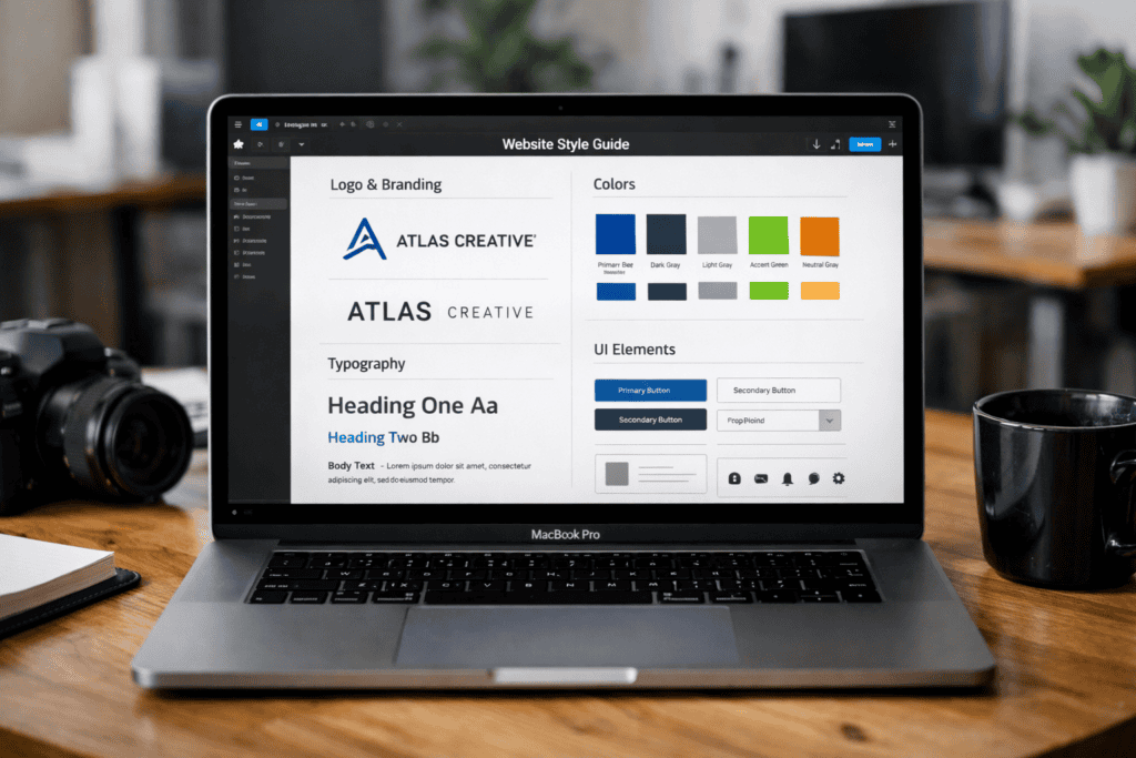
A website style guide keeps colours, type, spacing, and components consistent across every page. Building it in Figma makes the system easy to share, update, and reuse, because design tokens and components live in one source of truth. This guide explains how to set up foundations such as colour styles and text styles, then turn common UI patterns into reusable components. The result is faster design work, cleaner handover, and fewer visual inconsistencies.
Key takeaways
- Build Figma colour styles for brand, neutrals, and semantic states like success and error.
- Set a type scale with text styles for headings, body, captions, and line-height rules.
- Create reusable components for buttons, inputs, and navigation with clear variants and states.
- Use Auto Layout and spacing tokens to keep padding, gaps, and alignment consistent.
- Document icon rules, image treatment, and grid breakpoints to support responsive layouts.
- Publish the style guide as a shared library and enforce updates through versioned changes.
Define the scope, audience, and governance for the style guide
Set the scope before building components in Figma, or the file will grow without clear rules. Decide whether the guide covers only UI (colour, type, spacing, components) or also content standards such as tone, accessibility, and imagery. Name the audience in practical terms: designers need reusable components, developers need token names and states, and marketers need approved patterns for landing pages.
Define governance as a workflow, not a document. Assign an owner for approvals, set a change process, and record version history in the Figma file description and page structure. Use shared libraries and publish updates on a schedule so teams pull changes through Figma libraries instead of copying frames. Link decisions to evidence where possible, such as WCAG requirements for contrast and focus states.
Clear scope and governance reduce rework, prevent conflicting components, and make handoff predictable across releases.
Set up a structured Figma file: pages, sections, grids, and naming rules
Teams usually organise a style guide file in Figma using either page-first structure (Pages for Foundations, Components, Patterns) or feature-first structure (Pages for Checkout, Account, Marketing, and so on). Page-first keeps tokens and components easy to find and reuse across products. Feature-first can speed up work on one area, but it often duplicates styles and drifts from shared rules.
For a website style guide, page-first structure works best because it keeps decisions central: colour, type, spacing, and components live once, then every template pulls from the same source. Feature-first still has a place for large sites with distinct brands or microsites, but it needs stricter governance to avoid parallel “mini style guides”.
Set up a small, predictable set of pages, then use Sections inside each page to keep scrolling manageable. In Figma, Sections also make it easier to present the file in Present mode and to link people to the right area.
- Pages: 00-Read me, 01-Foundations, 02-Components, 03-Templates, 99-Archive (numbering pins order).
- Sections: group by topic (Colour, Type, Spacing, Grid, Buttons, Forms) and keep each section to one screen width where possible.
- Grids: define a desktop grid and a mobile grid as layout styles, then apply them consistently to frames.
- Naming rules: use “Category/Item/State” (for example, Button/Primary/Hover) and match names to design tokens where possible.
Strict naming and page order add a little overhead, but they reduce search time, prevent duplicates, and make handover cleaner for developers.
Build core foundations: colour tokens, typography scale, spacing, and layout rules
Create foundations as reusable tokens, then bind every component to those tokens. In Figma, set up colour styles for semantic roles (for example, text, background, border, accent, success, warning, danger) rather than naming by hue. Map each role to a clear ramp (50–900) so hover, active, and disabled states stay consistent. Keep contrast in mind while you build ramps; check combinations against WCAG requirements before components inherit the colours.
Build typography as a scale, not a list of one-off sizes. Create text styles for headings, body, and UI labels with explicit line-height and letter-spacing, then lock them to a small set of font weights. Use naming that encodes intent and level (for example, Type/H1, Type/Body/Regular, Type/Label/Small) so developers can map styles to CSS tokens without guessing.
Set spacing and layout rules with a base unit (commonly 4px or 8px) and apply it to padding, gaps, and grid gutters. Add layout grids to key frames and define breakpoints with max widths and column counts. When tokens drive colour, type, and spacing, updates stay centralised and the website UI remains consistent across pages and templates.
Create reusable UI components with variants, states, and Auto Layout standards
Build each component once, then cover every common variation with variants and states. In Figma, create a component set for each UI element (for example, Button, Text field, Alert) and add variant properties such as Size (S/M/L), Style (Primary/Secondary/Ghost), and Icon (None/Leading/Trailing). Add a State property for Default, Hover, Pressed, Focus, Disabled, and Loading, then keep the naming consistent so developers can map states to CSS classes.
Use Figma Variants to reduce duplicate components and make swaps predictable. Bind fills, strokes, and text styles to your existing tokens, not to raw colours or ad-hoc font settings. Apply Auto Layout to every component so spacing and alignment stay stable when content changes. Set padding and gaps using your spacing scale, define min/max widths for inputs, and use constraints so icons and labels behave correctly in responsive frames.
Watch for variant sprawl. If a property creates more than a handful of combinations, split the component (for example, separate Button and Icon button) or remove rarely used styles. Avoid mixing fixed widths with Auto Layout, since it breaks resizing and causes inconsistent truncation. Check interactive states at 100% zoom and in a prototype; focus rings, disabled contrast, and loading indicators often drift when teams rely only on static frames.
Publish, document, and maintain the library: versioning, handoff, and update workflow
Publish the style guide as a shared library so every file pulls the same tokens and components. In Figma, move foundations and components into a dedicated library file, then enable it in Libraries for each project. Treat the library as a product: assign an owner, set review rules, and restrict edit access to reduce accidental changes.
Use versioning to keep releases predictable. Add a clear release note for each publish (what changed, what to update, and any breaking changes), and keep component names stable so instances do not detach. When a change is not backwards compatible, duplicate the component and deprecate the old one with a visible label and a removal date.
Make handoff explicit by linking design decisions to build artefacts. Map token names to CSS variables, document component states developers must support, and link to the canonical library file in tickets and documentation. Run a short update cadence (weekly or fortnightly) so fixes ship quickly without constant churn.
Frequently Asked Questions
What should a website style guide include when you build it in Figma?
Build a single source of truth for your UI. Include colour palettes with usage rules, typography styles, spacing and grid, and layout breakpoints. Add reusable components (buttons, forms, navigation) with states and variants, plus iconography and imagery rules. Document accessibility basics, tone of voice, and examples of correct and incorrect use.
How do you set up a Figma file structure for a website style guide that stays organised?
Use one dedicated Figma file and split it into clear pages. Keep foundations separate from components, then document patterns and examples.
- 00 Cover (purpose, owners, update log)
- 01 Foundations (colour, type, spacing, grid)
- 02 Components (buttons, forms, cards, navigation)
- 03 Templates (page layouts and sections)
Name frames consistently and publish styles and components to a shared library.
How do you create and document colour styles in Figma for consistent use across pages?
Create colour styles as Variables (recommended) or Paint Styles. Define core tokens (brand, neutral, semantic) and set modes for light/dark if needed. Apply colours only through these tokens, not ad-hoc fills.
- Name consistently (for example: Brand/Primary/500, Neutral/100, Semantic/Success/500).
- Add descriptions and usage notes in the style/variable details.
- Publish the library and enforce use via components and design reviews.
How do you define typography styles in Figma, including headings, body text, and spacing?
Create text styles for each role: H1–H6, body, caption, and button. Set font family, weight, size, line height, letter spacing, and paragraph spacing, then save each as a named Text Style.
- Use an 8px spacing system and apply it through Auto Layout padding and item spacing.
- Keep consistent naming (for example, “Heading/H2” and “Body/Regular”).
How do you build reusable UI components in Figma and document their states and variants?
Build components from consistent base elements, then convert them into a Component and create a component set. Use Variants for size, theme, and layout, and add interactive states (default, hover, pressed, disabled) in Prototype. Document usage with clear layer names, variant properties, and short notes in a dedicated “Components” page.
How do you use Figma Auto Layout and constraints to keep style guide components responsive?
Build each component with Auto Layout so padding, spacing, and alignment adapt as content changes. Set frames to Hug contents for text and icons, and Fill container for elements that should stretch. Apply constraints (Left/Right, Top/Bottom, Centre) to pin key layers, and test by resizing the parent frame.
How do you share, version, and maintain a Figma style guide for ongoing website updates?
Publish the style guide as a dedicated Figma file and share access by role: view for stakeholders, edit for owners. Use Pages for sections and Libraries for reusable styles and components. Version with named checkpoints and clear change notes. Review monthly, retire unused tokens, and require updates through a single maintainer.