
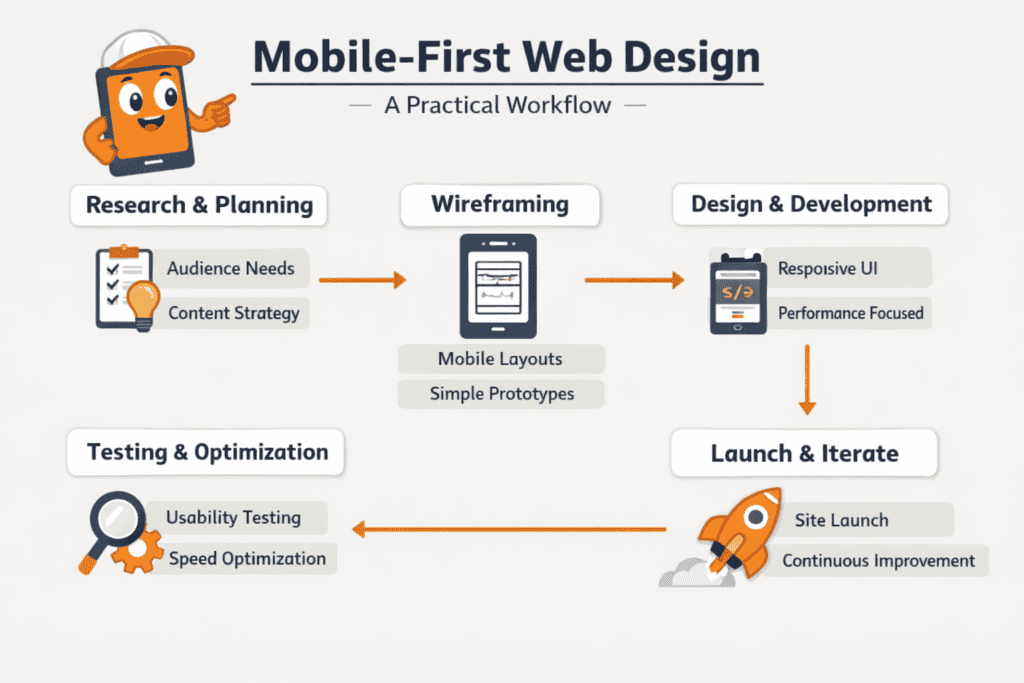
Mobile-first web design builds a website’s mobile layout first, then scales up to tablet and desktop breakpoints. This reverses the traditional desktop-down workflow. It forces early design decisions around limited screen space, touch interaction, and slower network conditions. This guide covers the core workflow stages: content prioritisation, responsive layout techniques, performance constraints, and testing methods that ensure a consistent experience across all screen sizes.
Key takeaways
- Start each design in a 375px-wide viewport before building any desktop layout.
- Use single-column layouts on screens narrower than 480px, since they outperform multi-column grids.
- Set body font size to a minimum of 16px to keep mobile typography readable.
- Make all tap targets at least 44×44 pixels to prevent mis-taps and reduce bounce rates.
- Test on real Android and iOS devices, not just browser DevTools emulation.
- Set breakpoints where content breaks, not at fixed device widths like 375px or 414px.
- Keep total page weight under 500KB and Largest Contentful Paint under 2.5 seconds.
What Mobile-First Design Actually Means for Your Build Process
Begin your design in a 375px-wide viewport before you touch any desktop layout. This forces every element, including navigation, typography, and calls to action, to earn its place under the tightest constraints. It also prevents you from compressing or hiding key content as an afterthought.
This constraint is technical as well as visual. Google’s mobile-first indexing means its crawler reads your mobile HTML to determine rankings, not the desktop version. If content exists only in a desktop breakpoint, it is effectively invisible to search.
This changes your build sequence. Write CSS with mobile base styles first, then extend them using min-width media queries as screen size increases. Keep desktop overrides at the end of the cascade, not the foundation. Define your scope before this stage, because retrofitting a desktop-first codebase to meet mobile-first standards typically requires rewriting layout logic from scratch.
Structuring Layouts and Typography for Small Screens First
Source: article content (16px body text minimum; 44×44px WCAG 2.1 target size; 48dp minimum interactive area; single-column guidance under 480px).
Single-column layouts consistently outperform multi-column grids on screens narrower than 480px. They remove horizontal scrolling and keep the reading eye on a straight vertical path. Start every layout as a single column, then introduce two-column or grid structures only at the breakpoints where content genuinely benefits from side-by-side presentation.
Typography at mobile scale needs a minimum body font size of 16px. Anything smaller forces users to pinch-zoom, which Google’s web design guidance identifies as a direct usability failure. Keep line length between 45 and 75 characters per line; shorter lines become choppy, and longer ones strain comprehension. Set these values in rem units rather than fixed pixels so they scale proportionally with user accessibility settings.
Spacing amplifies the effect of both layout and type. Touch targets need at least 44×44px of tappable area to meet WCAG 2.1 target-size criteria. This requirement makes generous padding around buttons and links more critical at mobile scale than at desktop. Establish that padding in your base styles before you write a single media query, and the desktop layout inherits workable defaults rather than needing corrective overrides later.
Touch Targets, Navigation Patterns, and Interaction Design
Tap targets smaller than 44×44 pixels increase mis-taps on touchscreens. That frustrates users and inflates bounce rates. Apple’s Human Interface Guidelines and Google’s Material Design both set 48dp as the minimum interactive area for buttons, links, and form controls. Apply that minimum to every tappable element, including hamburger menus, close icons, and form checkboxes.
Mobile navigation works best as a bottom bar or a full-screen overlay triggered by a single icon. Bottom navigation keeps primary destinations within thumb reach, without stretching across the screen. Reserve the hamburger menu for secondary or overflow items, since hidden navigation consistently reduces discoverability compared to persistent controls.
Hover states do not exist on touchscreens. Any interaction that depends on :hover to reveal content will silently fail for mobile users. Replace hover-triggered tooltips and dropdown submenus with tap-to-expand patterns or inline disclosure. For form inputs, match the inputmode attribute to the expected data type: inputmode="numeric" for pin fields and inputmode="email" for email addresses. The correct keyboard then appears automatically, reducing input errors without any extra user effort.
Testing Tools and Breakpoint Strategies for Mobile-First Builds
Browser DevTools device emulation helps you check layout at common viewport widths. It does not replicate touch latency, font rendering, or GPU behaviour. Pair it with real-device testing on at least one low-mid range Android handset and one iOS device to catch rendering gaps emulators miss.
Set breakpoints where content breaks, not at fixed device widths like 320px, 375px, or 414px. Start at the narrowest viewport and resize outward. Add a breakpoint only when the layout degrades. This approach produces three to five durable breakpoints for most projects, rather than a growing list tied to specific phone models.
BrowserStack and LambdaTest provide real-device cloud testing without a physical device library. For performance validation, run PageSpeed Insights against the mobile tab, which applies a throttled connection and mobile user agent for accurate field results. Repeat after each significant layout change so regressions surface before launch.
Performance Constraints That Shape Every Mobile-First Decision
- Forces every element (navigation, typography, CTAs) to justify its place under tight constraints
- Reduces the risk of hiding or compressing key content as an afterthought
- Aligns the build with Google’s mobile-first indexing (mobile HTML is what’s evaluated)
- Retrofitting a desktop-first codebase to mobile-first standards can require rewriting layout logic from scratch
- Requires more discipline in the cascade (mobile base first; desktop overrides last)
- Demands real-device testing beyond emulation to catch touch/GPU/font rendering differences
Slow load times on mobile destroy conversion rates faster than poor visual design. On a mid-range device over a 4G connection, the median mobile page takes over three seconds to become interactive, and user drop-off rises sharply after the first two seconds. Set a performance budget before writing a line of CSS. A practical baseline is total page weight under 500KB and a Largest Contentful Paint under 2.5 seconds on a mid-tier device. Mobile users move between Wi-Fi, 4G, and 3G within a single session, so optimising for fast connections only is the wrong sequence.
Images typically account for 50–70% of total page weight on content-heavy sites. WebP cuts file size by roughly 25–35% compared with JPEG at equivalent quality, and AVIF reduces it further on supported browsers. Use srcset so the browser loads only the resolution the screen needs. Apply the native loading="lazy" attribute to defer off-screen images. Limit web font variants to two weights per family, and use font-display: swap to keep text visible during load. Self-host rather than relying on third-party CDN availability. These decisions carry direct SEO consequences: SEO in 2026 continues to weight Core Web Vitals heavily, so performance budgets set during design affect organic rankings before a single optimisation pass begins.
Frequently Asked Questions
What steps should a mobile-first web design workflow include from planning to launch?
Create mobile wireframes, define breakpoints, and set a performance budget before writing any code. Build and test the smallest screen layout first. Scale up with progressive enhancement. Validate on real devices before launch. Check touch targets, load times, and content hierarchy at each viewport size.
How do you prioritise content and navigation for small screens without losing key information?
Small screens demand a clear hierarchy decision, not a content removal exercise. Put the single most important action or message first. Then layer secondary content beneath it with progressive disclosure, using accordions, expandable sections, or tabbed panels. Navigation works best when condensed into a fixed bottom bar or hamburger menu, which keeps the main viewport clear for content.
Which breakpoints and layout patterns work best when scaling a mobile-first design to tablets and desktops?
Use 768px breakpoints for tablets and 1024px for desktops as your baseline. Add intermediate breakpoints only when content breaks, not on a fixed schedule. Grid layouts often shift from single-column on mobile to two-column at tablet, then three or four columns at desktop. Navigation typically expands from a hamburger menu into a full horizontal bar.
How can you test mobile-first designs for performance, accessibility, and touch usability during development?
Test continuously, not only at the end of a build. Use Chrome DevTools device emulation to check layouts, Lighthouse to review performance and accessibility scores, and a physical device to confirm touch target accuracy. Axe or WAVE can also catch accessibility issues that automated audits miss.
What common mobile-first design mistakes cause layout shifts, slow load times, or poor interaction on phones?
Most mobile layout and performance problems come from four mistakes. Oversized images without responsive sizing slow load times. Fixed-width containers break layouts on narrow screens. Tap targets smaller than 44×44 pixels frustrate users and raise bounce rates. Missing viewport meta tags make browsers render pages at desktop width, which triggers unwanted zoom.